Best New Construction Home Staging Project
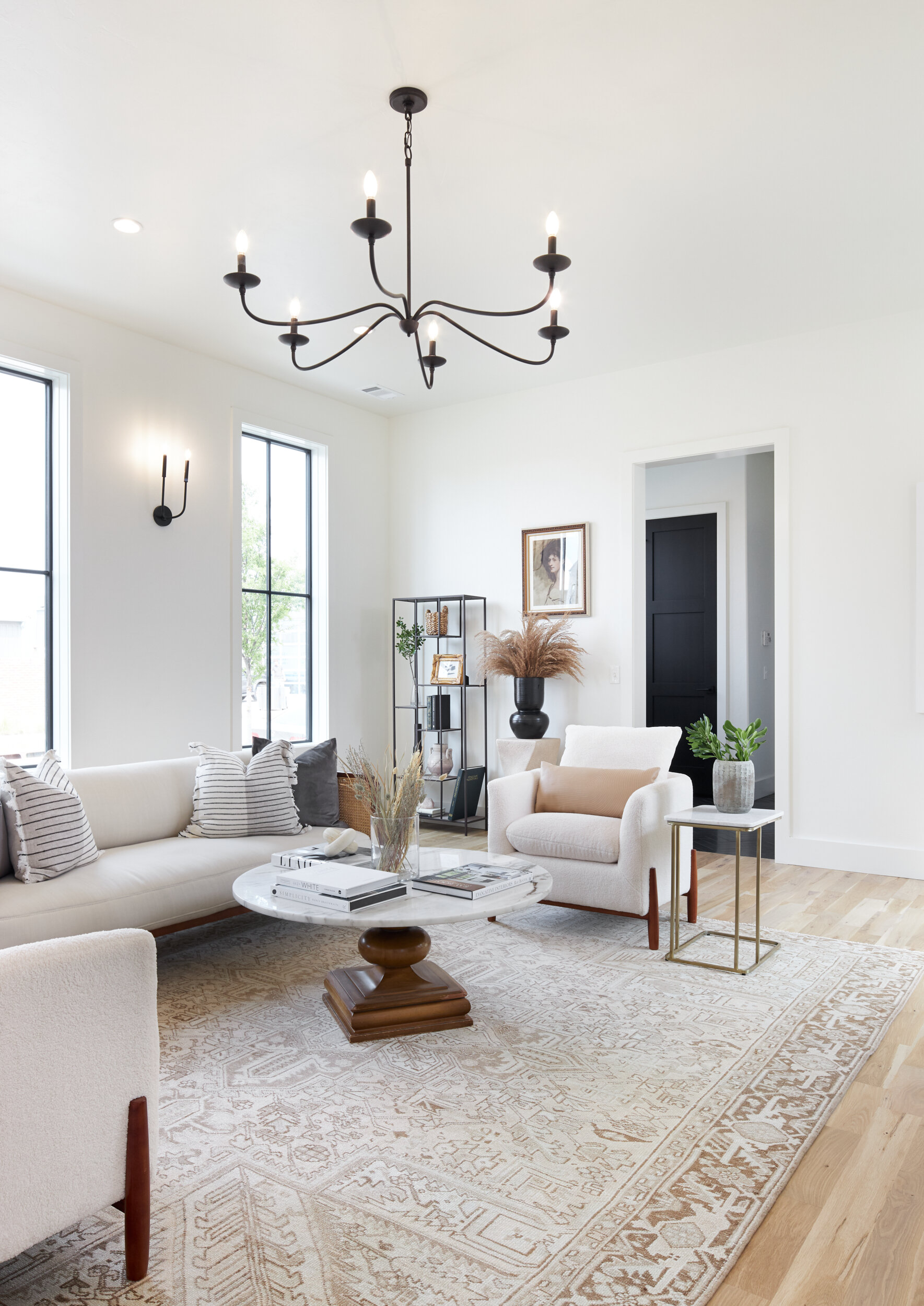
This home was a new build last year in a fun upcoming development. The builders described the overall design to have a New England style to it, so I wanted the staging to be a reflection of an upscale, collected look. The living room concept really stemmed from this gorgeous vintage Heriz, and then I complimented it with cane, marble and warm wood tones.
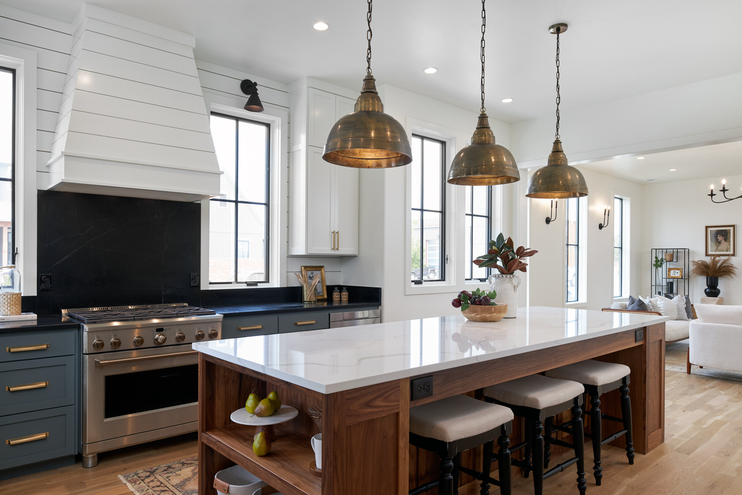
The gorgeous kitchen really shone on it's own, so I just punctuated it with a few textural pieces and some greenery. The view from the kitchen into the living room is one one my favorites angles. It show all the unique architectural details highlighted by soft, statement pieces like this antique runner and cane sofa.
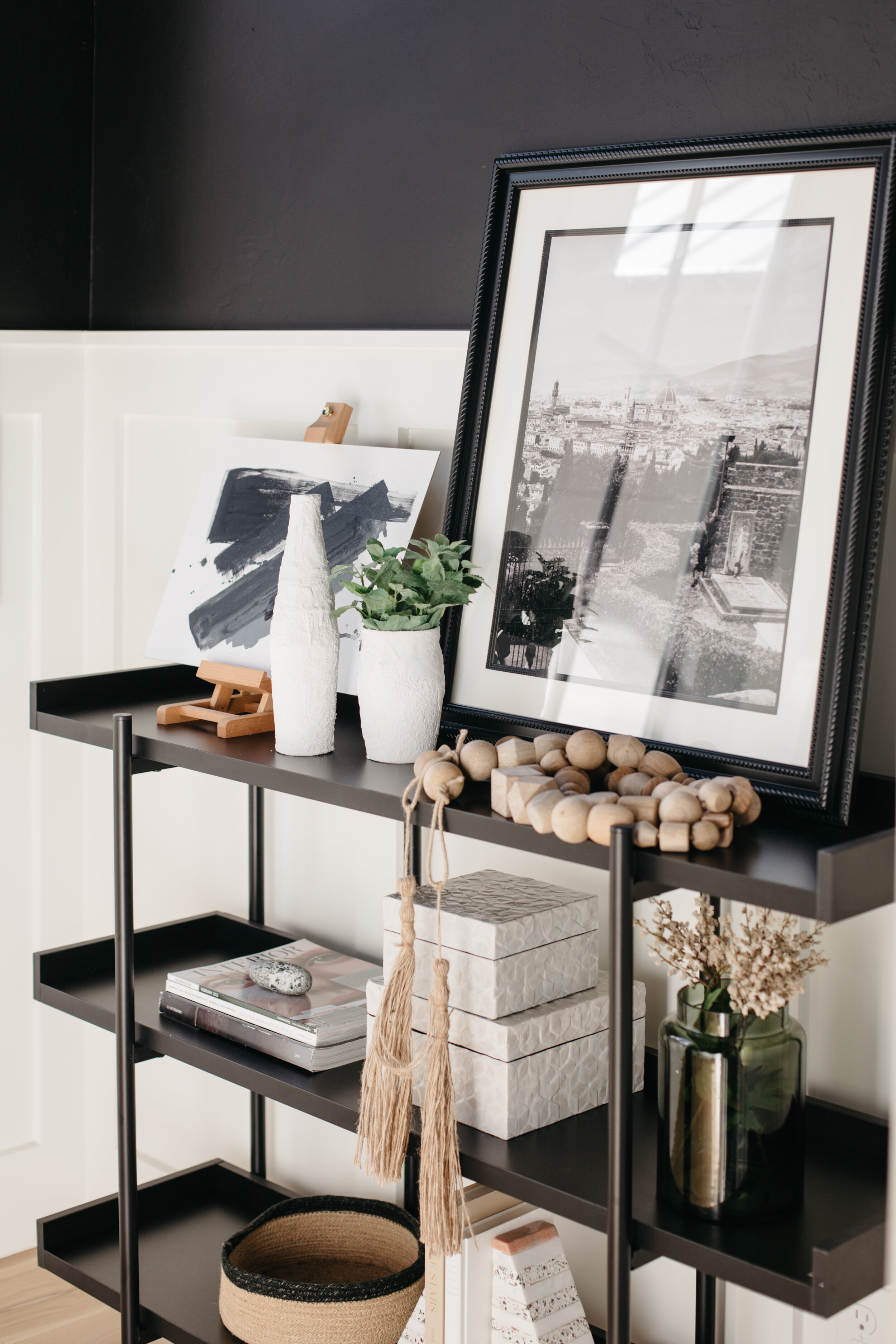
Styling pieces like a bookshelf, gives opportunity to add character and life to the space. Love how antique pottery and books harmonize with modern art here, and a foraged branch gives it all a delicate finishing touch.
A modern take on a classic Windsor chair had to be featured in this design that confidently melded old and new. I decided against a rug for this space to showcase the beautiful oak herringbone pattern, and chose a warm farmhouse table to complement the wood tones found throughout the space. And I also created the custom dried floral arrangement to add an extra bit of elegance.
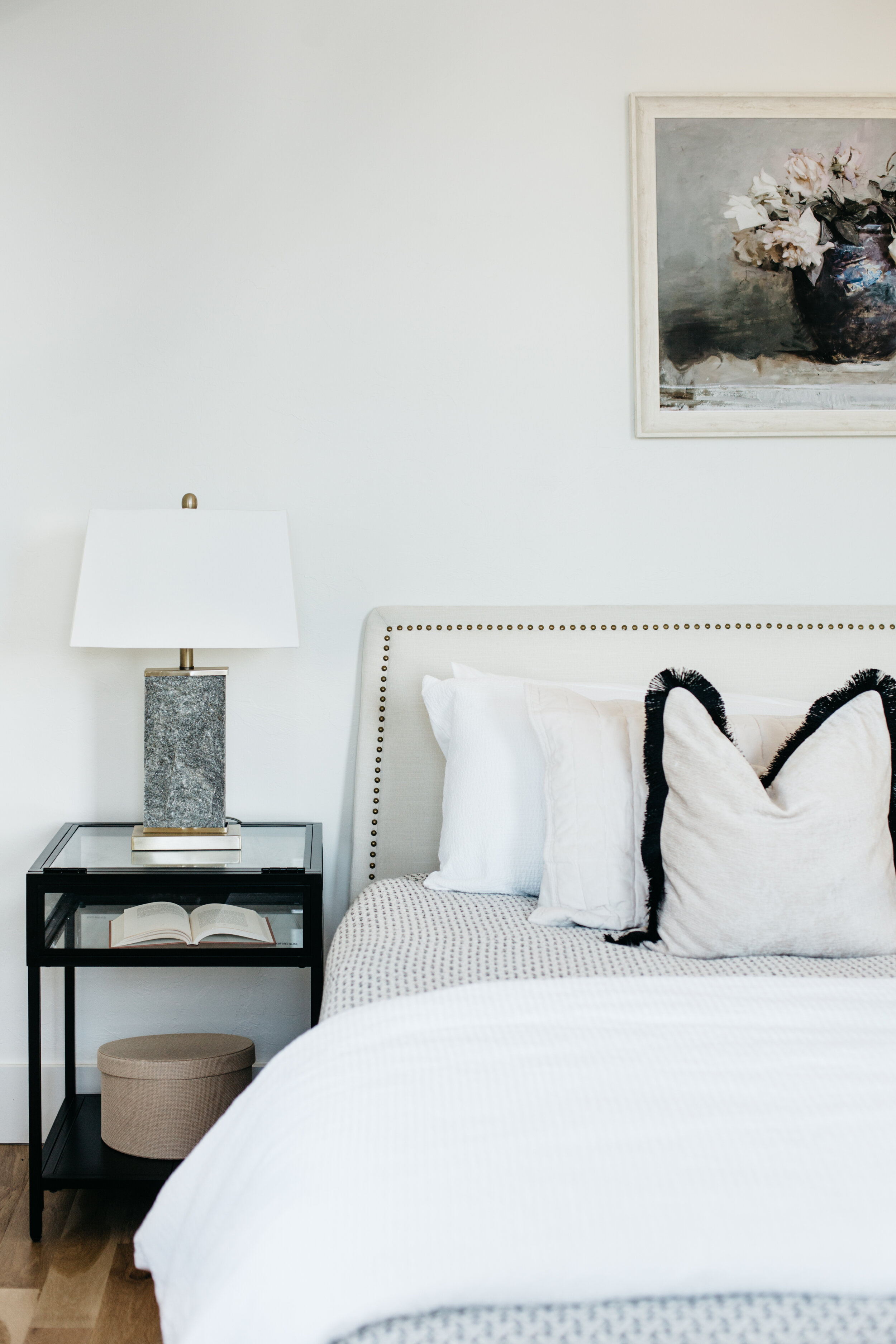
The primary bedroom with soaring ceilings needed an equally stunning bed. This white velvet studded bed fit the bill! I dressed it up with minimal pattern in blacks and whites to keep it classic, and a little fringe for fun! Glass, stone, velvet play together to give this bedroom diverse materiality. And the Impressionist style print brings the elegance.
We also wanted to give the landing at the base of the stairs of moment of its own. And of course adding in one of my signature accessories: a bust!
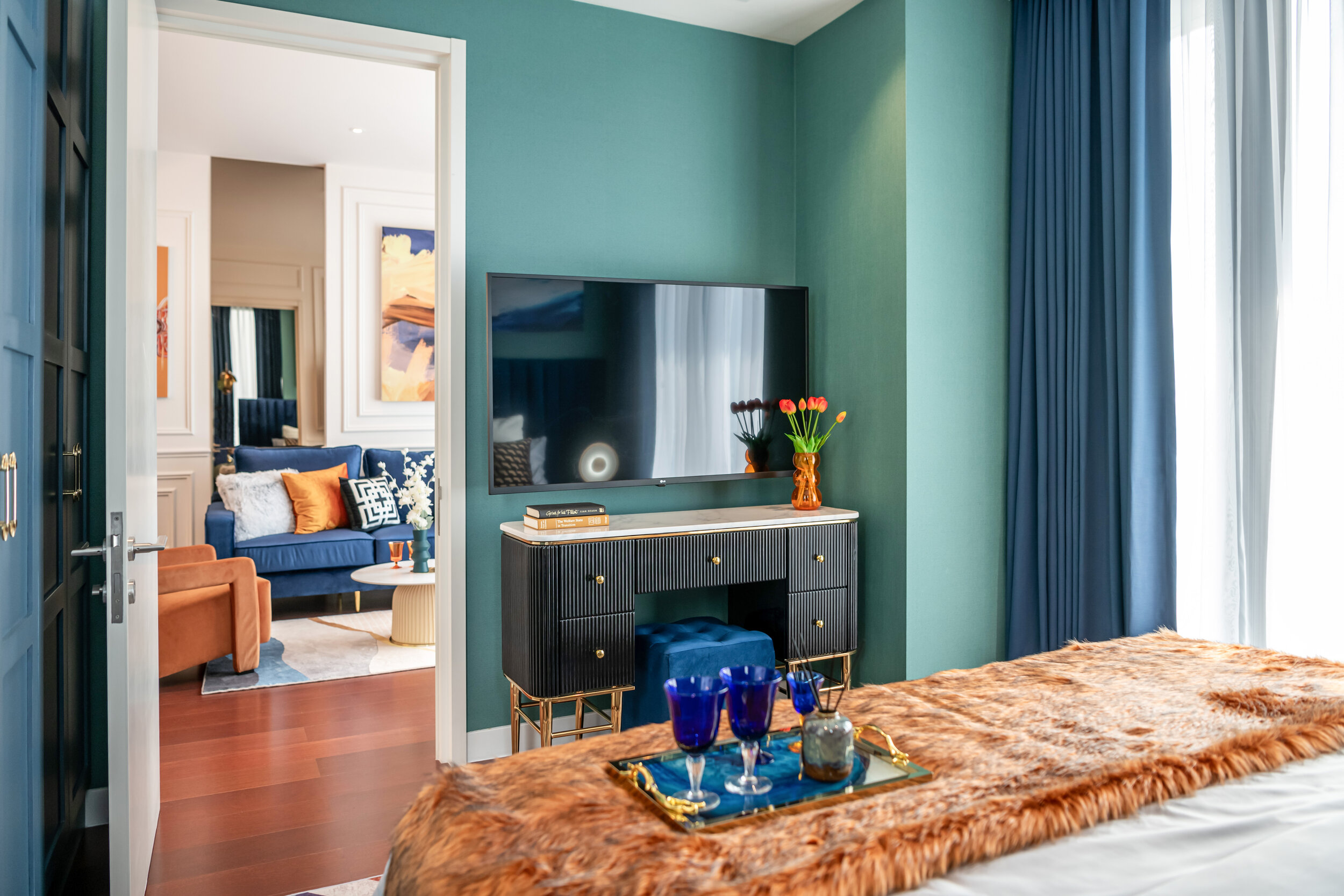
A newly built condominium completed in 2020, it is located in one of the trendiest neighborhood in the city. The building is called " KHUN BY YOO", it is the first branded residences designed by YOO & Philippe Starck (one of only 36 existing yoo inspired by Starck projects in the world). The building stands at 27 storey and is composed of 148 units.
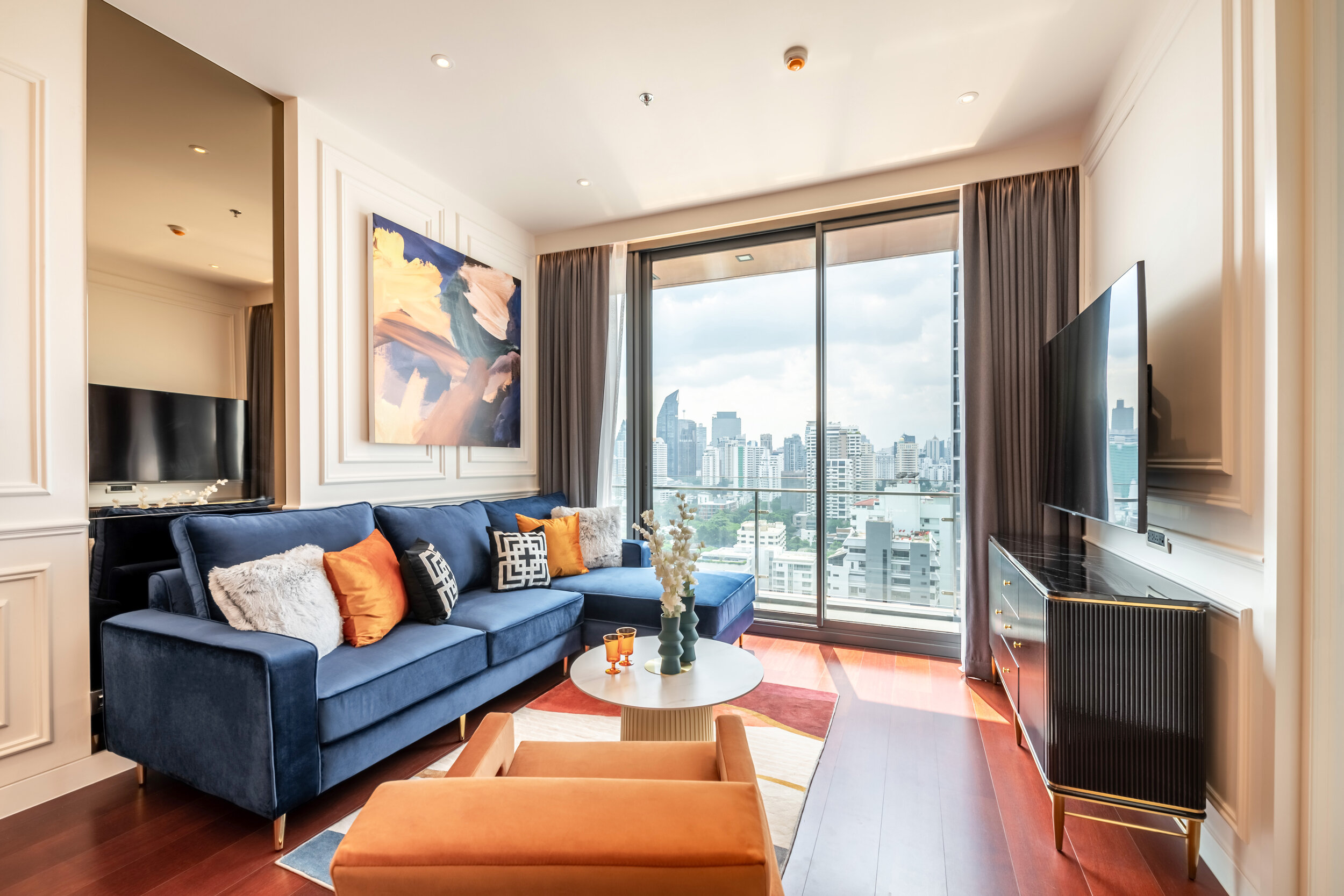
The story behind the design of this building is that it is inspired by the industrial heritage and the distinctive lifestyle of the area. The property size is 82 sqm. Two-bed, two-bath with a city view. By creating a statement entrance, I’ve paired a bold dramatic chandelier aligning with a custom champagne gold mirror to draws the eyes and get that wow factor.
I mixed multiple colours in the space to spice up the room. I want to create a new experience for the user, as the property is located in the trendiest neighbourhood the space- it should be all about the fun!
Orange represent brightness, fun and is a energetic colour. Blue is the strongest hue of the colour psychology spectrum, representing calmness and serenity of the space. When mixing these two colours together, they bring out the atmosphere I wanted to create.
All of the decorative accessories are sourced locally. The glasses and vases are made by using the mouth-blown technique. This made every piece unique. The process of creating these mouth-blown glasswares is a slow and beautiful process. The result of each piece is stunning!
In this project, we also utilized oversize artwork to create and immediate impact on the space. The painting on the artwork lifted up the mood of the space. A splash of different colours added, creating an iconic piece for the room. The colour hint of the artwork also match the beautiful hardwood floor of this property.
Decorative and luxurious wall moldings were used to create a contrast between classic features against the modern and trendy furniture. The wall molding added a visual interest and depth into the room, which gave the space a unique structural personality. Terracotta orange and a rich navy blue striked the perfect level of contrast of the space.
I like to use vibrant and abstract oversized artwork to make a simple wall a little more exciting. I inject my own signature style into the space by using a contrast of green wallpaper pairing with rich navy blue furniture.
A custom built-in closet was designed to match with the space. The space played with shape and scale in so many different ways. You can find different geometric pattern hidden in the space if you look closely into each detail of the space: Triangles in the cushions. Hexagons in the rugs. Squares in the closet doors. Circles in the pendant lights. In our line of work, devil is always in the details!
I also added black-coloured furniture to calm down the strong colorful tones between the rooms.
For the second bedroom of this property, I designed a custom, full height, built-in headboard to make a big impact of the space. The colour palette of this room is simple and sleek. Using colour like green and brown, they blend in together nicely. Dark colour green added elegance and soothing emotions, whereas brown accents are a great way to warm up a space and make it feel homier in an instant. I added a hint of yellow into this calming space to remind the potential buyers of sunshine, energy and happiness!
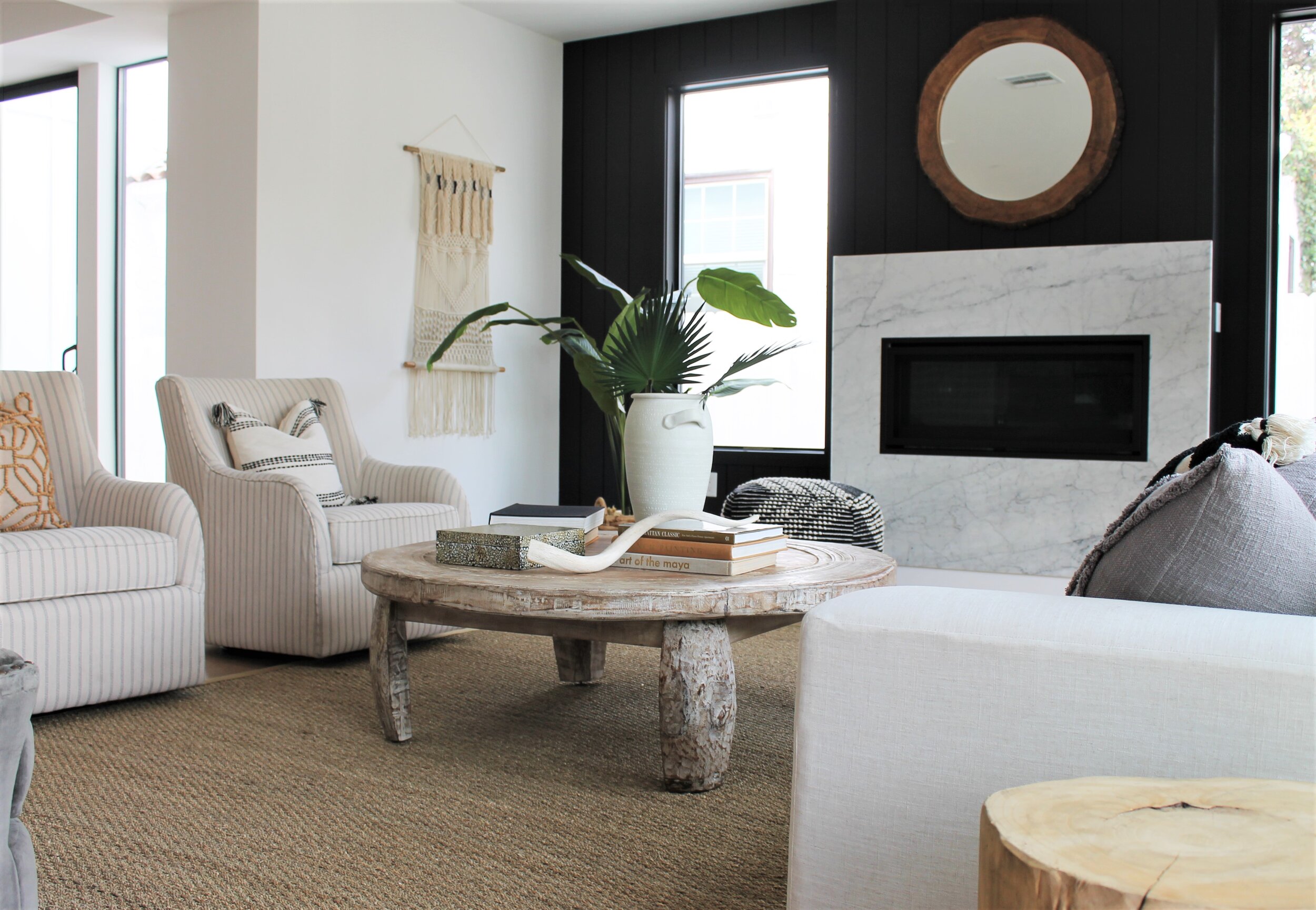
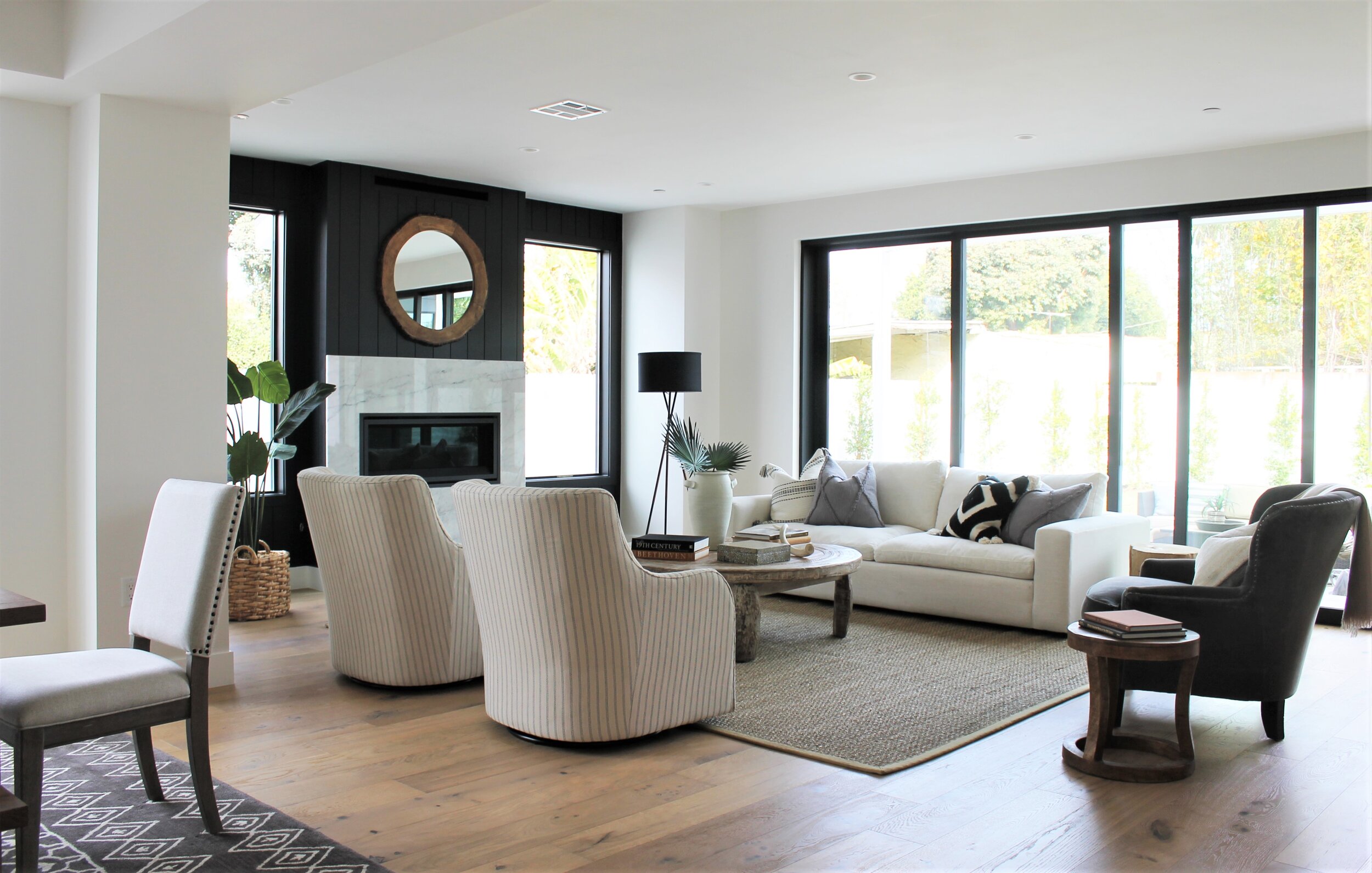
The expansive living room in this new-build spec home is traditional in tone -- but fresh in its outlook. Dark shiplap created a great contrasting element for us to play with by bringing in linens and neutrals to balance it out. We laid down a nubby seagrass rug and brought a large scale coffee table into the mix.
When staging for a newly constructed home, we always keep in mind that warmth is key. The pair of softly pinstriped wingback chairs have a softer frame and rounded edges, thereby bringing a sense of home and comfort to the space. Buyers may love all things new, but you've got to charm them with a little vintage throwback too.
The developer client wanted to show this home as a true family refuge, a place for a young family to grow. We achieved the family-friendly look by bringing in a bench to match our large-scale dining table and chairs. Underneath, a tribal pattern rug to add just a little edge.
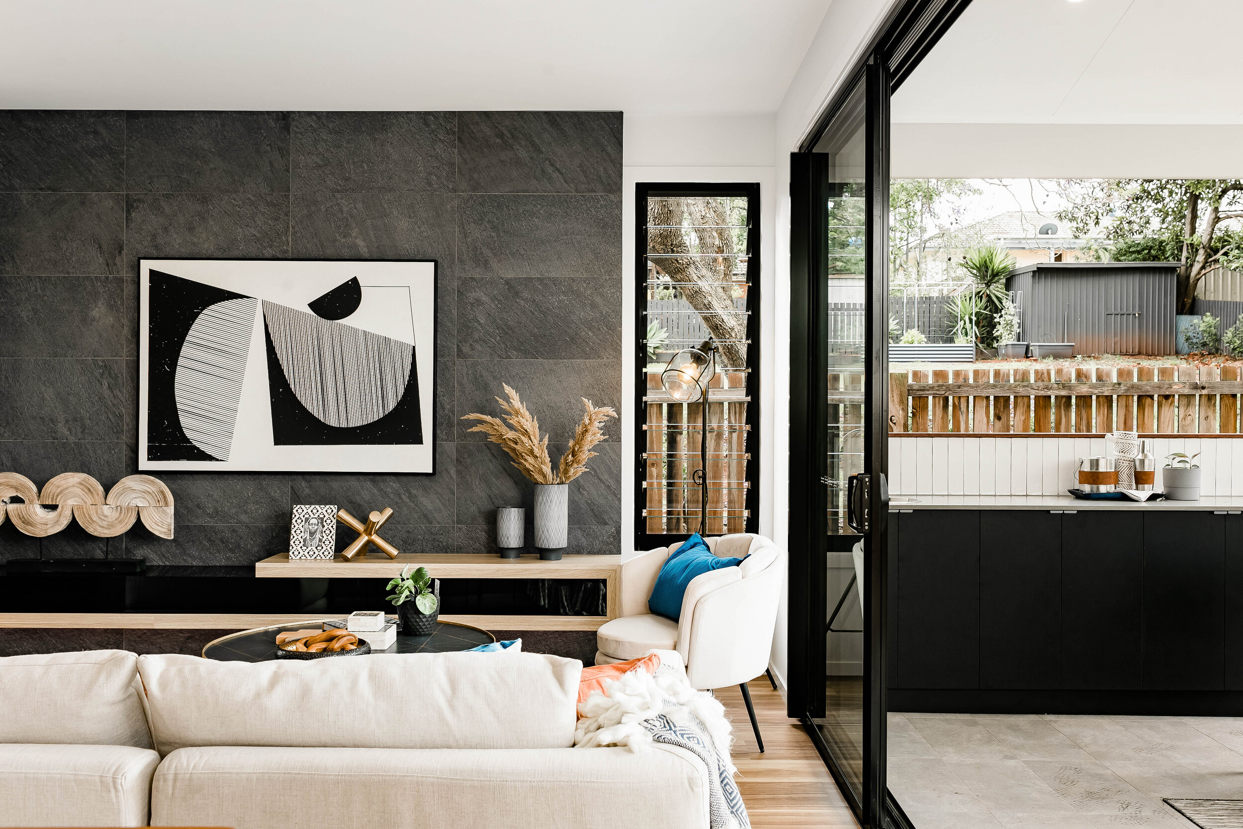
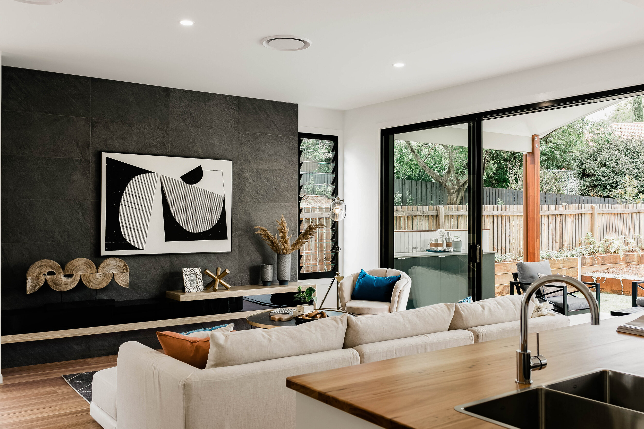
Scale. Scale. Scale. In large rooms with high ceilings and floor-to-ceiling sliding doors, everything you bring in must have the appropriate scale. Our favorite coffee table -- resembling an antique Tibetan wheel -- stands up to the size needs of this living room and provides ample space to display a large vase, a naturally shed horn and some hefty coffee table books.
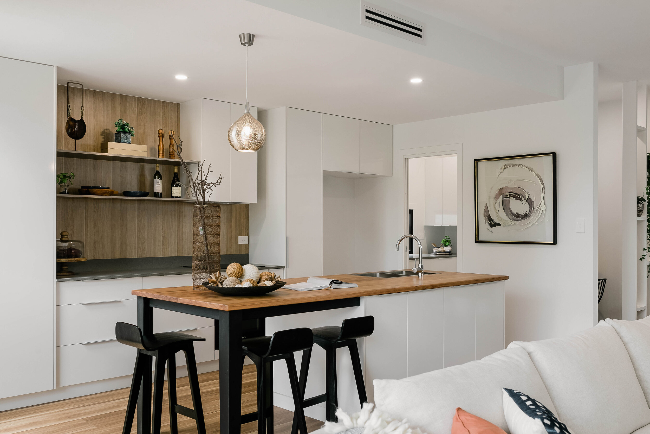
To accent this waterfall kitchen island we staged with a set of three Tolix counter stools. For decor, we kept it simple and scaled up. Dough bowls and large Monstera leaves never disappoint for drama and charm.
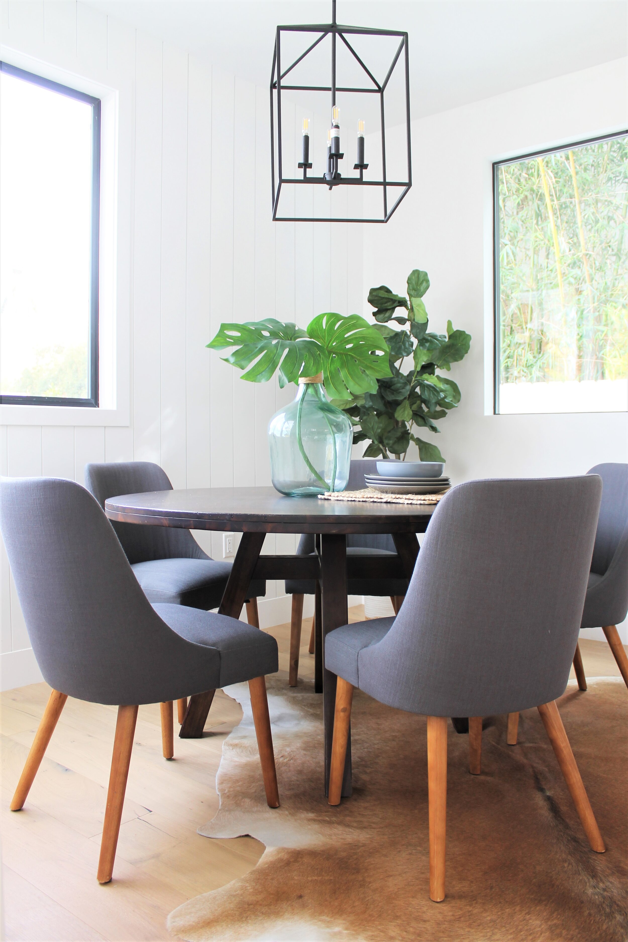
A breakfast nook off the kitchen afforded us the opportunity to bring in a Mid Century modern vibe with some dark gray chairs around an industrial style round table. MCM works so well with Modern Farmhouse. Just ask Joanna Gaines!
Working from home has never been nicer when you have a corner like this in your home office. A comfy Navajo print wingback chair with super traditional lines is modernized with this trendy fabric, while office necessities can be stored on bookcase shelves. A cowhide rug continues the earthy feel of this space.
The primary bedroom features more dark shiplap, and we took full advantage of it with a linen nailhead bed and warm neutral bedding. A fluffy Moroccan tile pattern rug plays off the contrasting of trad-modern elements, like the pairing of an MCM bench with a more traditional nightstand.
The tall tufted linen bed, Mid Century modern nightstands and chair and burlap lamp shades all speak to each other in this Farmhouse Modern mix of a room. It's easy to achieve this look when you keep the palette neutral and play with a combination of warms and cools. Neutrals always play nice with each other.
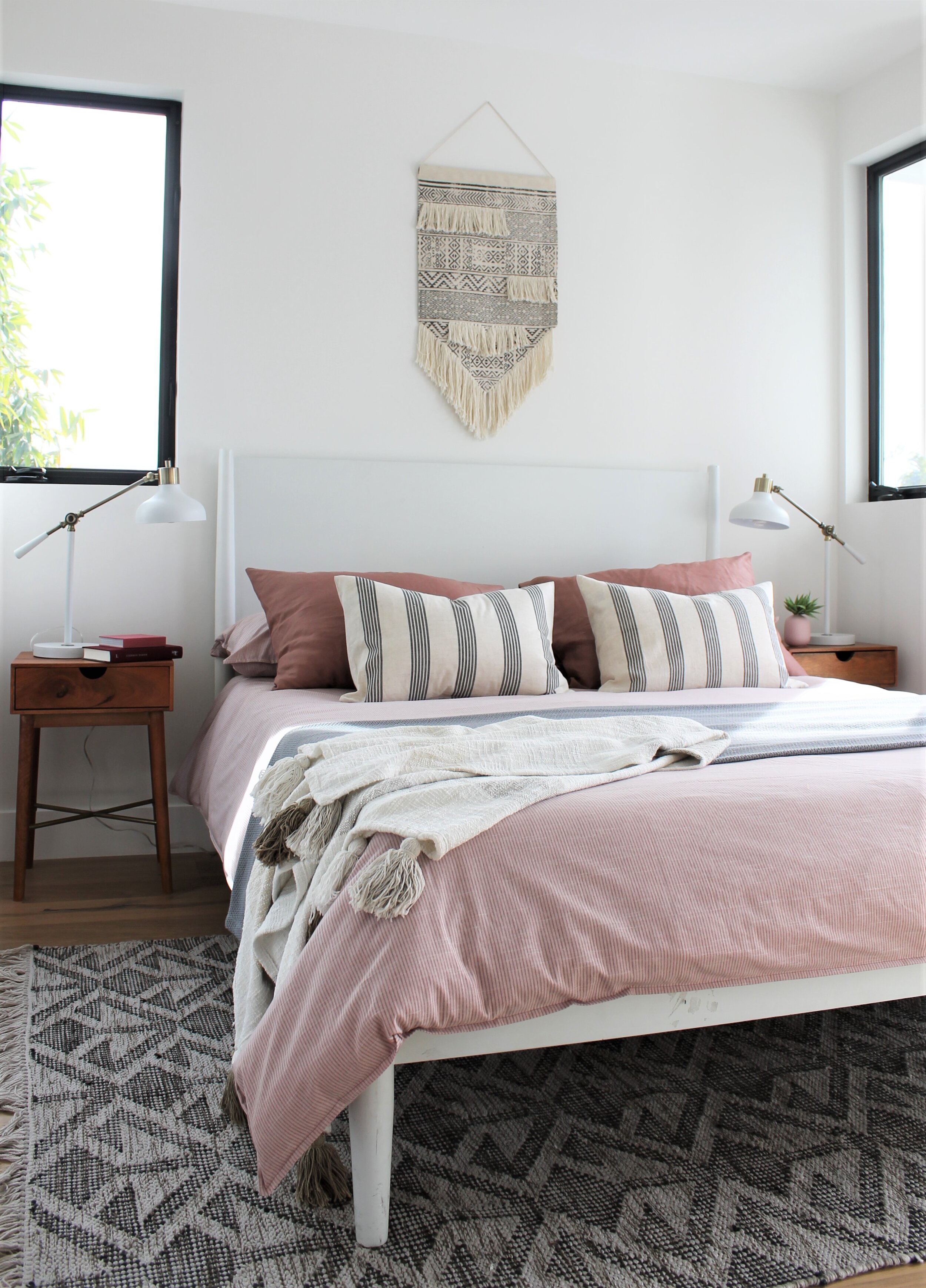
We're crushing on blush. Especially when paired with gray which adds just an edge of sophistication and tones down the sweetness. This guest bedroom would be perfect for a teen girl -- or just about anyone who shares our passion for pink. Macrame and fabric wall hangings are the just-right touch hanging above the bed and a tribal pattern rug warms the floor.
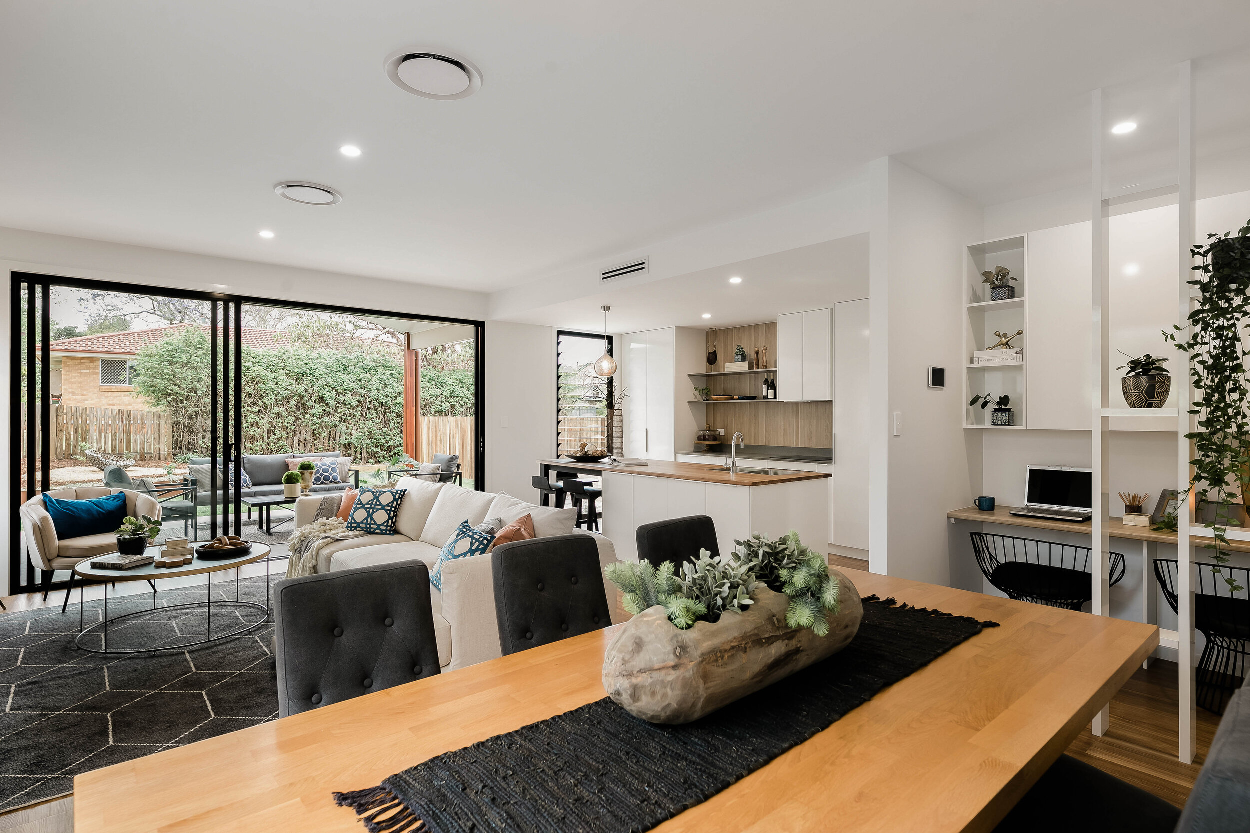
I like to bring the colours from the outside inside - also doing this to create connection inside and outside.
Notice the connection of the dining table - balancing / connecting to the outside brick house. This property had a small lot, so this was purposeful to connect spaces and surroundings.
I also like to connect spaces through the use of colour. Also trying to draw the eye away from neighbouring building.
In the bathroom, simple styling / staging - let the area speak for itself.
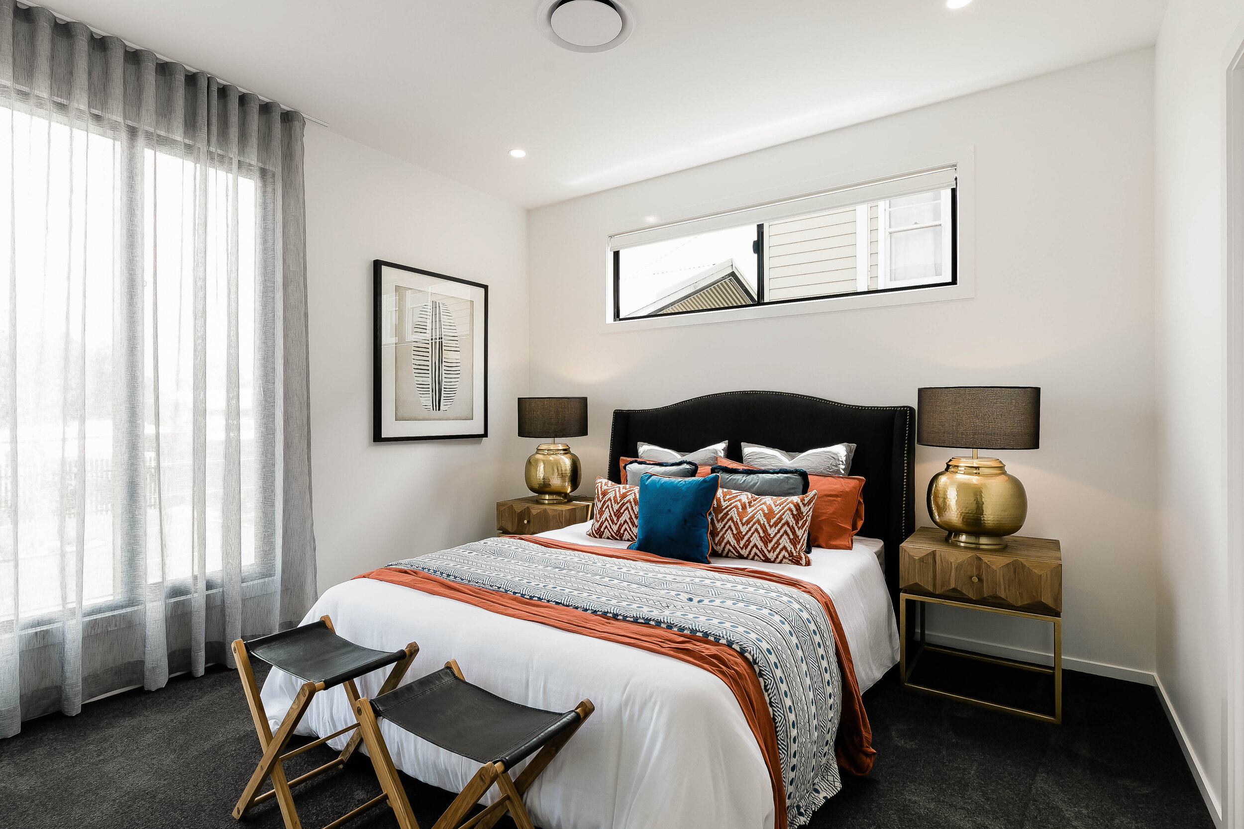
In the bedroom, we have to work with the room layout. Ideally, we would have put the bed on the other wall, but due to cupboards and windows, we had to situate on blank wall. Did look great walking through.

