Best Occupied Home Staging Project
-
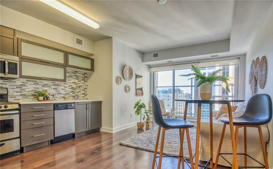
Let’s embark on a journey through the transformation of this small 1-bedroom condo downtown, from its initial state before staging to its significantly improved post-staging presentation.
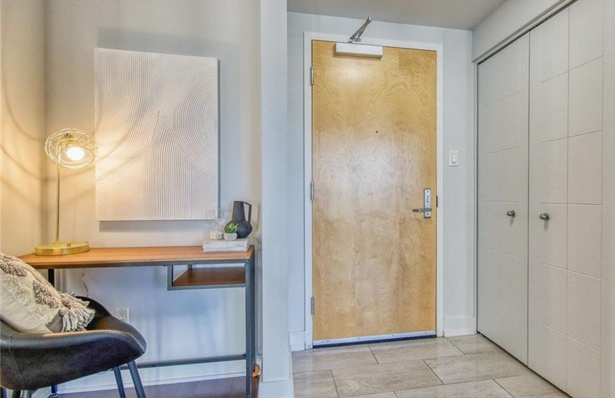
Before staging, the living room lacked style and brightness, failing to captivate potential buyers. The uninspiring shot as you walked in did little to appeal to their senses.
After staging, a remarkable change took place. The wall decor was introduced, instantly adding character and personality to the space. An area rug was strategically placed, creating a defined and inviting seating area. The addition of greenery brought life and freshness into the room, making it much more welcoming overall.
Moving on to another area within the living room that served as an office space, we identified an opportunity for improvement. To ensure the living area could truly function as intended, we relocated the office setup elsewhere. In order to appeal to a younger urban professional demographic, we opted for a boho theme characterized by natural textures and neutral colors.
Similarly, with regard to the bedroom in its initial basic and dreary state, our staging transformed it completely. Carrying over our boho theme throughout the condo, we added carefully selected pieces that instantly injected style into this previously lackluster room.
Finally, there was a nook within the space that had been serving double duty as a non-functioning office space and bike storage area. Through effective staging techniques, we were able to transform this nook into a cozy little office space - eliminating the need for a makeshift office set up within the living room itself.
By recognizing areas of improvement and employing strategic staging choices tailored to target demographics, we successfully elevated every corner of this condo. With enhanced style and functionality combined with thoughtful design elements throughout each space, this transformed property is now poised to capture buyers’ attention and generate increased interest in its listing.
-
Let’s explore the transformation of this 2-bedroom family apartment, from its initial state before staging to its remarkable post-staging makeover.
Before staging, this apartment housed a couple and a 4-year-old child. While the blue living room was kept as is, most of the remaining rooms underwent painting to refresh the space.
After staging, significant changes were made to enhance the overall aesthetics and functionality. In the living room, we rearranged their existing sofas and introduced two accent chairs to create a more inviting seating area. The huge wall of books was organized, and new sofa pillows were added for a touch of freshness.
Moving on to the dining room and kitchen island in their initial state, we identified areas for improvement. The kitchen cabinets were painted by contractors to brighten up the space, while the light fixture above the island was replaced. While maintaining their furniture, we incorporated artwork and accessories to bring our own touch to complete the staging.
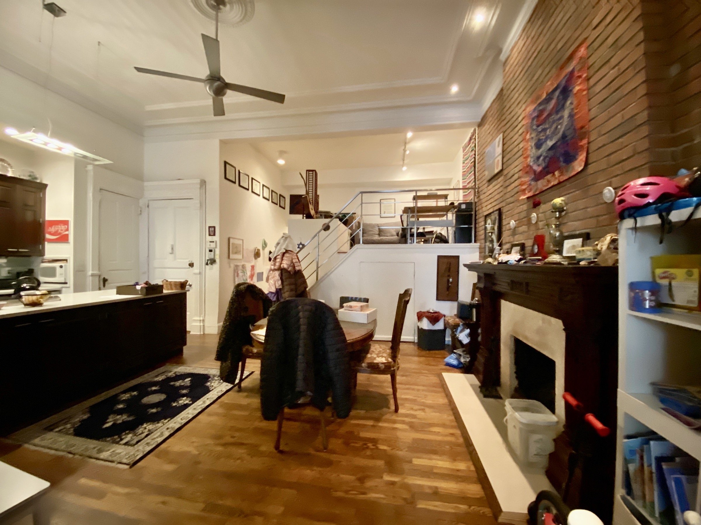
In another view of the dining room before staging, art pieces were removed along with a bookshelf and children’s toys. We introduced a tripod lamp along with artwork, florals, and accessories that complemented their vintage dining set. These additions transformed the space into a sophisticated yet comfortable area for family meals.
The primary bedroom underwent changes too - one sofa was removed to create a more spacious atmosphere. Artwork and lamps were replaced or repositioned accordingly. New white bedding and sheepskin throws were added for an added touch of softness and elegance.
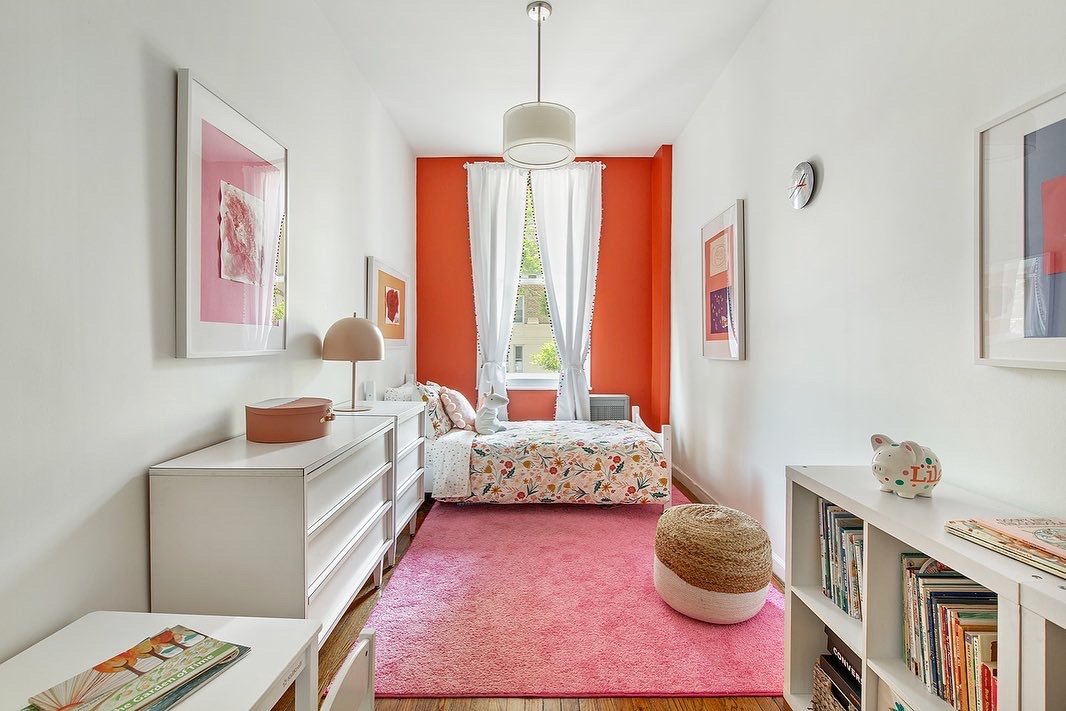
In the child’s bedroom before staging, although there was a cool orange accent wall, it appeared cluttered. To address this issue, we encouraged them to store excess pieces while changing out the light fixture for an updated look. New bedding and curtains were also introduced to revitalize the space. Additionally, we framed some of their daughter’s artwork to give it a polished finish.
Through strategic staging choices that focused on decluttering and introducing fresh elements, we successfully transformed this 2-bedroom family apartment into a more inviting and harmonious living space. The careful selection of furniture, artwork, bedding, and accessories elevated each room while maintaining a sense of personal touch.
-
Let’s explore the transformation of this loft, from its initial state before staging to its remarkable post-staging makeover.
Before staging, the living room appeared cluttered and in need of a refresh. It lacked a sense of cohesion and could benefit from an update.
After staging, a significant transformation took place. A new sofa was introduced, instantly adding a fresh and inviting focal point to the room. Layering rugs brought texture and warmth to the space while creating visual interest. The existing table was painted white to brighten up the area, and decluttering efforts created a more streamlined and organized atmosphere.
In the kitchen, which required both a refresh and decluttering, changes were made to elevate its overall appearance. Contractors were brought in to paint the kitchen cabinets, instantly brightening up the space. The light fixture over the island was replaced for an updated look. Existing furniture remained while new artwork and accessories were added to complete the staged effect.
Moving on to another view of the dining room before staging, clutter was evident and styling opportunities were needed. During staging, all unnecessary clutter was removed, allowing some of the client’s own items to be thoughtfully styled on countertops for an added touch of personalization.
The dining room underwent a true “less is more” approach after staging - simplicity became key in showcasing its potential.
Lastly, we approached the office space with decluttering and styling in mind. By eliminating unnecessary items and carefully arranging what remained, we achieved an organized and appealing office environment that exudes productivity.
Through strategic staging choices that focused on decluttering, refreshing elements, and thoughtful styling, this loft underwent an incredible transformation into an inviting living space. Each room now showcases its unique potential while maintaining functionality and aesthetics.
-
Let’s explore the transformation of this space, from its initial state before staging to its remarkable post-staging makeover.
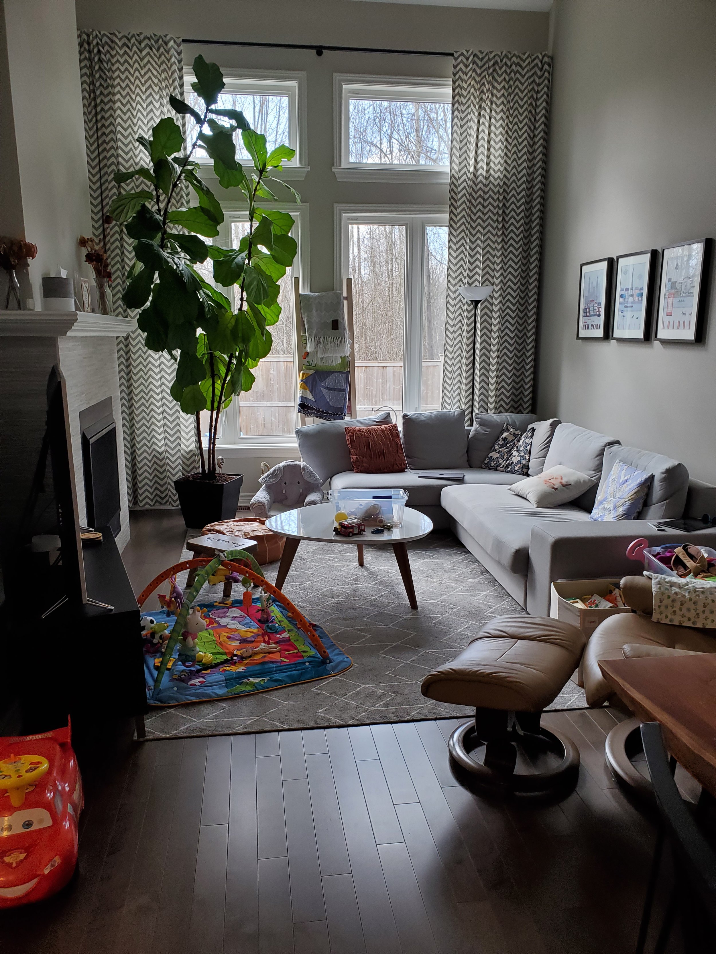
Before staging, the living room appeared overcrowded and lacked a clear sense of purpose. It served as a multi-purpose space for a young family of four.
After staging, the room was brought back to its intended purpose, and the furniture was simplified to maximize space. The inspiration for the color scheme and Mid-Century Modern (MCM) style came from the wallpaper in the dining room.
In another area before staging, there was a non-functioning space for the family. The vibrant wallpaper drew attention to this fact.
After staging, our goal was to illustrate that there was potential to easily incorporate a table and chairs into the breakfast nook. By reimagining this space, we showcased its functionality and versatility.
Moving on to the fireplace, it initially appeared uninspiring and got lost within the room.
After staging and working with the color palette provided by the wallpaper, we had fun styling the mantel and giving the fireplace much-needed life. This added visual interest and became a focal point within the space.
Through strategic staging choices focused on maximizing functionality and enhancing aesthetics, we successfully transformed this area into an inviting and stylish living environment. Each room now exudes a clear sense of purpose while showcasing its unique potential - all tailored to appeal to prospective buyers.


